Connecting You to a World of Illustration
Words by Garrick Webster
With large, global distilleries seeking to diversify in recent years, there has been a revival of ready-to-drink mixed cocktails. Even famous old single malt whiskies are now available in RTD cans. The sector has become even more interesting and competitive with the arrival of small batch distillers, like Dillon’s in Ontario, whose innovative flavouring combinations are creating a buzz.
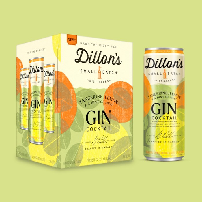
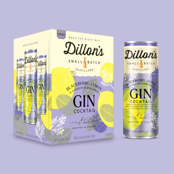
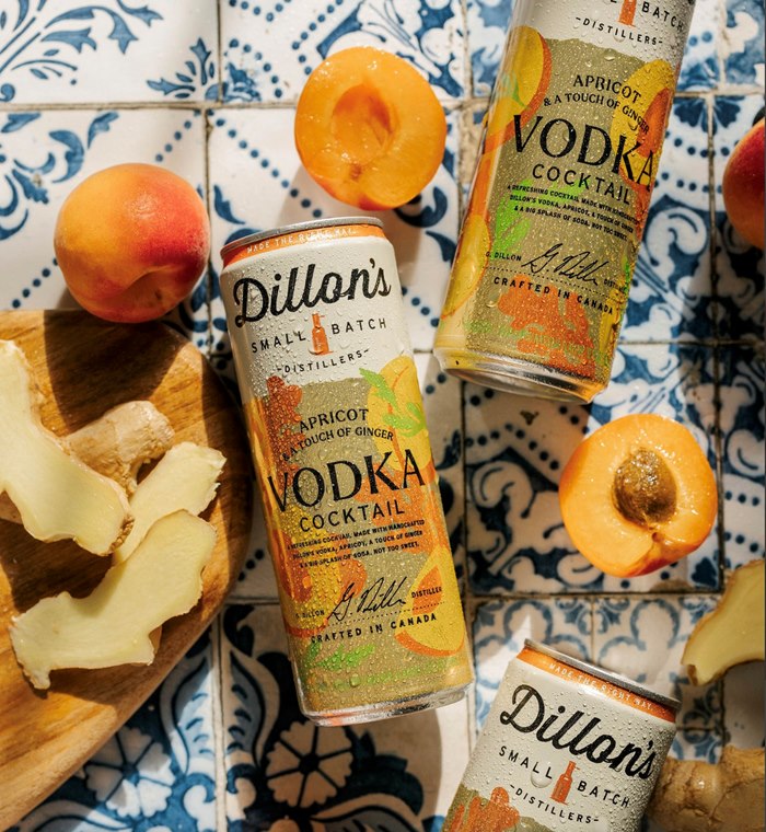
Written down, flavours like Black Cherry and a Touch of Cranberry or Pear, Lime and a Hint of Cucumber sound intriguing – but it’s with the colourful, textured packaging artwork by Drew Bardana that the company’s Gin Cocktail cans really catch the eye.
Drew started working with Mark Anthony Group, the Dillon’s brand’s parent company, in 2021, creating artwork for other products. Then, when Dillon’s began developing its fruity, gin-based range of cans, he seemed the natural choice. As the product line-up has grown to a dozen flavours and counting, Karen Kaller, artist rep with IllustrationX in New York, has been supporting the client and the artist, helping hone the creative direction and ensuring deadlines have been met.

A style to realise the client’s vision
"Drew's unique graphic style with big shapes, bright colours and subtle use of texture made him the perfect artist for the client’s vision. Each package design is as unique as the flavours created," remarks Karen.
The brief sent to Oregon-based illustrator Drew was very thorough. Graphic layouts for the cans had been established with the Dillon’s logo, product name, regulatory text and so forth already in position. All Drew had to do was… well… draw the fruit.
"My initial response looking at the brief was, ‘Man, this is too easy.’ It was simple shapes of fruit and botanicals, no realistic rendering or additional textures. It was too good to be true. But that's where I was wrong. The simplicity of it all was the most difficult part,” says Drew.
Not all the graphic elements on the template Drew had clean edges. The main logo itself sits on a cream-coloured field with a papery texture and a torn edge. From tangerines to apricots and from watermelons to blueberries, Drew roughed up his illustrated fruit forms with textured edges – bringing personality to the fruit in a way that would work aesthetically with the can design templates.


From rough textures to vectors
"The Illustration also needed to be in vector format for the printing process, and that was a limitation too, so I developed a way to create a rough organic texture using the blob brush in Adobe Illustrator. It’s kind of like stippling but adding and subtracting small marks around
the edge of each shape. It takes time and focus, and can only be created by a human hand," says Drew.
With the illustration for each can, Drew focused on creating iconic representations of the individual fruits and botanicals. Working in his garage, which has been converted into a creative studio, he followed composition guidelines provided by the client to create an even mix of the flavours in each cocktail, conveying the sense that the flavours are balanced and unique.
"I was very attentive to the way the shapes overlapped and to their directional qualities – how they’re moving your eye through the can, making sure the details did not interfere with text and impede readability,” continues Drew. "This was unlike my previous work on children’s books or editorial – this truly was a puzzle."
Attention to detail
Working towards a look that would be organic, lean and iconic, the first can illustrations Drew created were supplied to for client feedback as works in progress. In close communication with the art directors at Mark Anthony Group, Drew made the refinements, adjustments and edits. As the series has grown, so has the collaborative understanding between artist and client – with support from Karen at IllustrationX.

"The feedback was very detailed, and I was grateful for that," says Drew. "The design team at Mark Anthony Group told me exactly what was working and what wasn’t. I wasn’t left scratching my head but inspired to improve on what had already been made. Having this kind of feedback from the client was very helpful and I feel the artwork is better for it."
While there isn’t a lot of drinks packaging in Drew’s portfolio, he is ideally situated to capitalise on his experience creating Gin Cocktail cans for Dillon’s. Oregon and the Pacific Northwest generally have been the epicentre of the craft brewing culture. A huge variety of
can and bottle designs have come with it, giving illustrators plenty of inspiration and opportunities along the way.

"What I've learned working with Marc Anthony group and the Dillon's cocktail series is that the printing process can be a limitation on how the artwork is made as well. There are regulations for the design and the text that is required on the can. Those are things that I haven't had to think about too much in the editorial and publishing world,” adds Drew.
And the overall outcome? Beautiful cans that catch the eye as well as the imagination, along with refreshing, uniquely flavoured cocktails for Canadian consumers to enjoy.