Connecting You to a World of Illustration
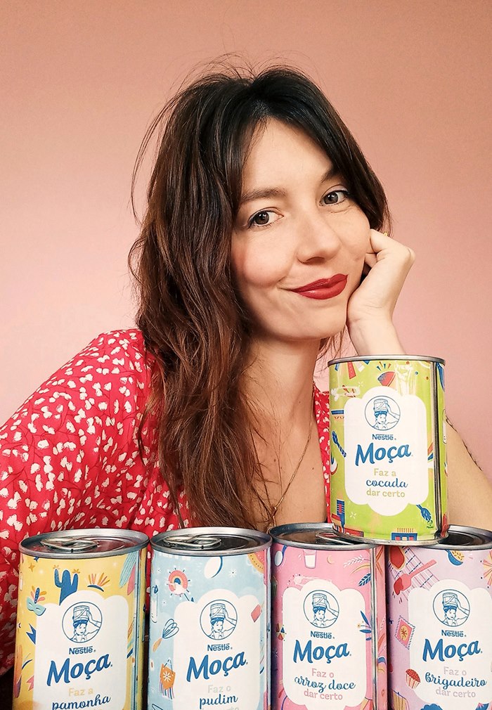
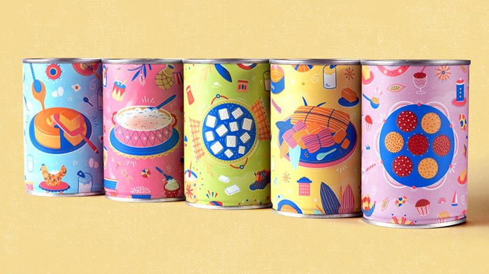
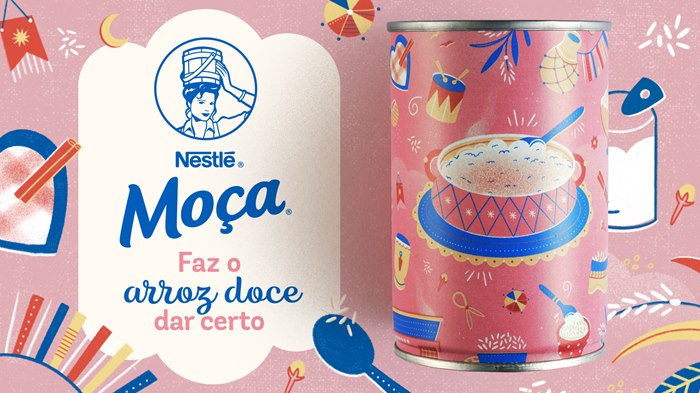
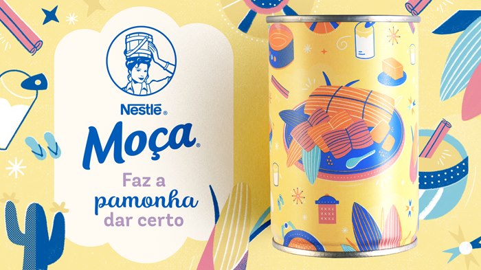
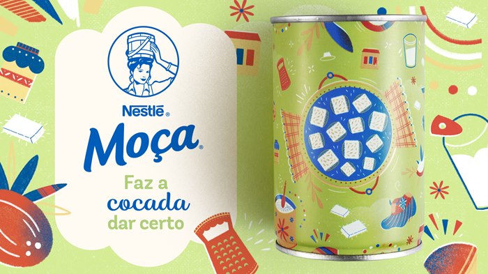
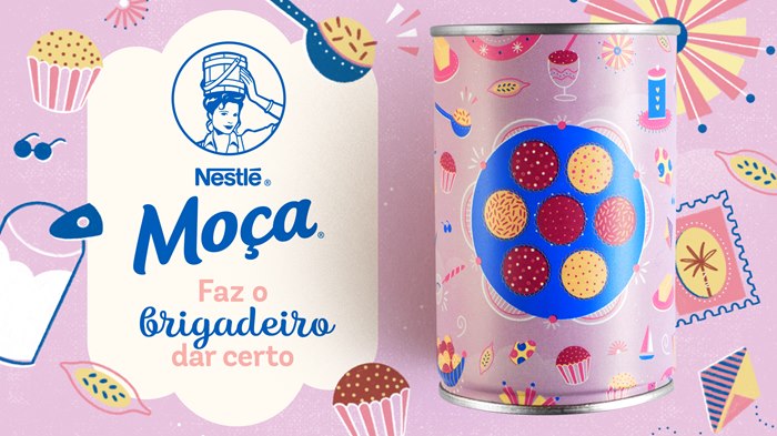
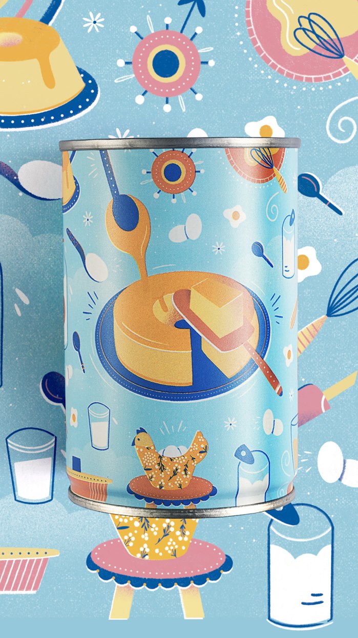
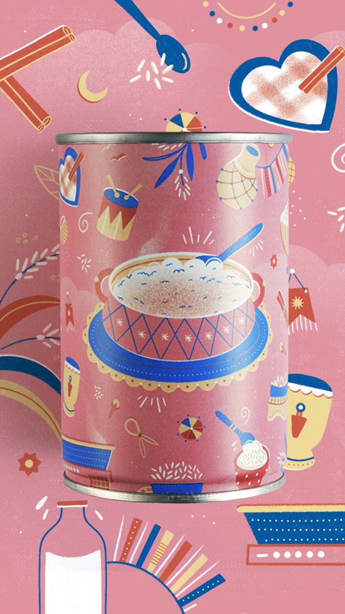
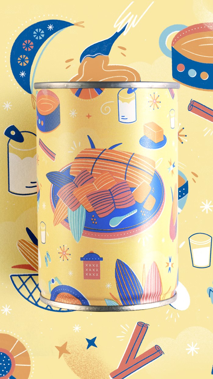
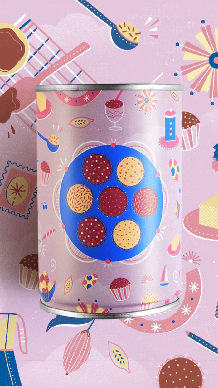
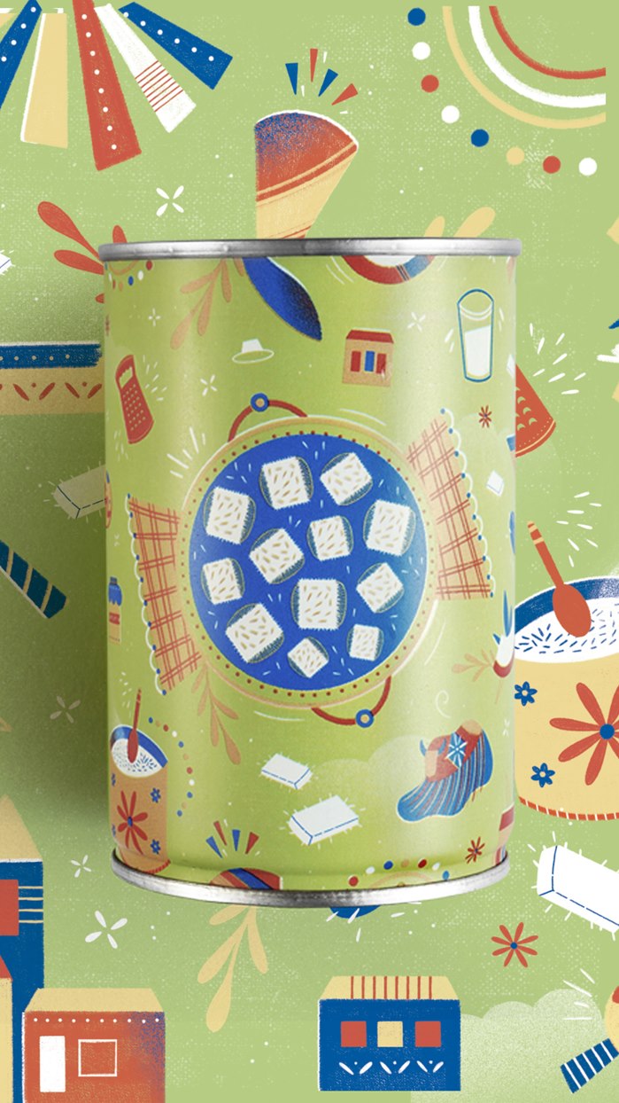
SÃO PAULO, BRAZIL – Celebrating over a century as Brazil’s favourite dessert, Nestlé Moça has arrived with a new look flaunting gorgeously nostalgic illustrations by the Curitiba-based artist Bárbara Tamilin. The five classic flavours now come in collectible tins wrapped in artwork as delicious and comforting as the condensed milk puddings inside.
Commissioned by FutureBrand São Paulo on behalf of Nestlé Brazil, Bárbara digitally painted images of desserts centrally in each illustration, surrounded by the ingredients that make them unique. The varieties include pamonha, brigadeiro, rice pudding, pudding and cocada and all are made following recipes widely enjoyed across Brazil.
“I wanted the illustrations to be easily recognizable to consumers, with light, smooth colours and a nostalgic aesthetic. It was also important to me that the five cans could sit together and create a beautiful combination that showcases Brazilian cuisine,” says Bárbara Tamilin.

LOCAL FLAVOUR
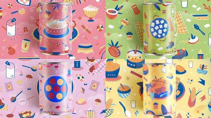
With a look and feel reminiscent of a colourful 1930s recipe book and painted in Bárbara’s gentle, whimsical style, the illustrations not only depict the desserts but contain a variety of decorative details that will tug at the heartstrings of Brazilian consumers – little reminders of what makes Moça special.
Milk, eggs, sugar and condensed milk are regular motifs across the artworks, alongside cooking implements like blenders, mixing bowls, wooden spoons and that uniquely Brazilian inclusion, the clay water filter. As well as recreating her mother’s kitchen, Bárbara enjoyed taking inspiration from recipes she loves and the national culture.
“Important elements in the illustrations are references to popular street parties in Brazil such as the São João Festival and Rio de Janiero’s Carnival, where puddings like these are consumed. I wanted to bring in aspects of our music, popular culture, architecture, clothing, fruit and more,” says Bárbara.

FRESH AND DIFFERENT
With its gentle pastel hues, the colour palette Bárbara used had already been established within Nestlé’s brand guidelines. Painting certain elements and scanning them in to preserve their real-world textures, Bárbara developed her imagery using Procreate on her iPad and Photoshop on her Mac.
From drafts to final artwork, the project unfolded as harmoniously as the illustrations she created, with just a few quick colour adjustments made before the packaging was ready to be printed.
“Barbara is an excellent professional. Her illustrations express exactly what we needed for this collection – all the delicacy and sweetness of the brand, with striking regional traits and many colours. Consumers have loved them, and the feedback has been very positive,” says Natália Goivinho, brand manager Nestlé Moça.

NATIONAL IMPACT
Now available in supermarkets, bakeries and pastry shops across Brazil, the cans featuring Bárbara’s illustration collection are winning admirers wherever they’re sold. She has been invited to talk about them on creative podcasts and friends have been sending her photos of the products on the shelves whenever they find them. After feasting on the desserts, people are using the cans as decorative flowerpots and pencil holders.
“This is certainly the biggest job I've done in terms of national visibility. I was so pleased with the brief and working on Moça has brought back many childhood memories. It’s cool to see them on the shelf and it’s impossible not to see Moça puddings when you go shopping,” says Bárbara.
Read part 2 of this feature here.